Even though 2019 has just begun, by taking a look at the top graphic design trends from 2018, we can begin to predict where and how these trends will move and morph in the year to come. From the Pantone Color of the Year to a new life phase for typefaces, here is our hypothesis of the top five trends for 2019:
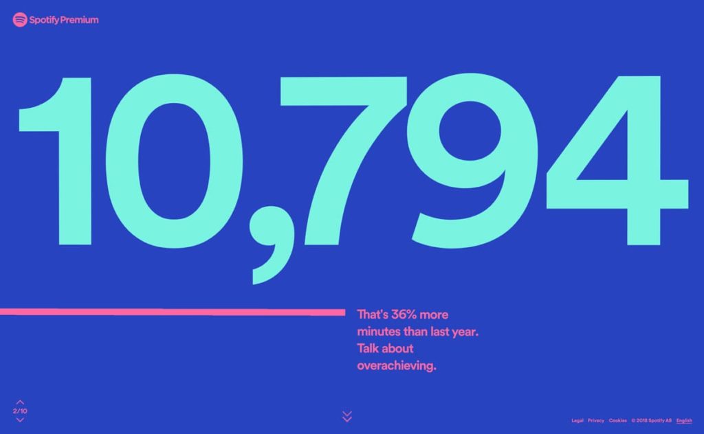
Image: Spotify
As far as we can tell, 2019 is going to be about color, color everywhere. Gone are the days of muted tones living on their own, as vivid, bold colors break into those palettes creating attention-grabbing contrast through interesting color juxtapositions. And as design leaders such as Apple and Spotify continue to utilize splashes of everything from cobalt to coral, other brands are sure to follow.
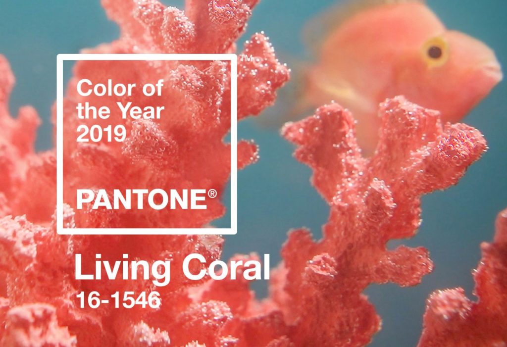
Image: Pantone
Speaking of coral: Every year designers across the globe wait patiently for Pantone to release their chosen color of the year. In 2018 we saw a surge of design featuring the selected shade Ultra Violet and we’re sure to see that trend continue this year. Get ready to see the bold, bright—and according to Pantone—“life-affirming coral hue with a golden undertone” in everything from accessories to packaging to interior design and beyond. That’s right, Living Coral which “energizes and enlivens with a softer edge” is here to stay. That is, until next year.
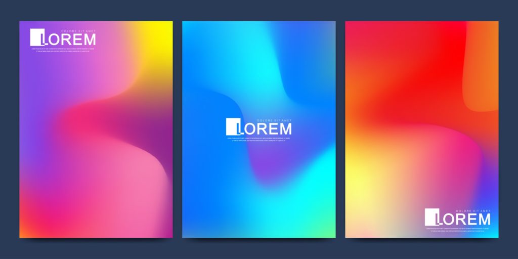
Last year we saw popularity for gradients begin and that trend is going to continue with full force into this next year. And with tons of vivid colors currently being used, we predict gradients will play into that trend by bringing in more than just one color family. What’s more, with the release the new Freeform Gradients tool in Illustrator 2019, this trend will move away from the standard linear duotone into a more blended, cosmic-looking style.
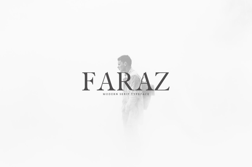
Image: Font Bundles
In a world that has loved simple, clean sans serif typefaces for years, the serif is primed for a comeback. In the last ten years, fonts featuring the serif such as Times New Roman, GT Super, and Garamond have been seen as outdated and been replaced by sleeker, minimalist fonts such as Gotham, Proxima Nova, and Brandon Grotesque. Other than being a design preference, sans serif typefaces were often chosen over their fancier friends because serif fonts were harder to read on screens with poor resolution. But, as high-resolution screens have made their way into people’s everyday lives, we predict that these classic typefaces and their modern revivals will be making their way back to the forefront of design.
Gif: Google
Thanks to technological developments and computers’ improved ability to display web pages, adding movement to design will take center stage in the year to come. From motion graphics to 2D and 3D animation, cinema-graphs and more, we’re about to see design explode with activity.
Want to implement some of these new trends in your branding or printed materials? Find your nearest PostNet to get started.